
Product branding and design for a UK start-up.
I love a start-up!
And scrub life is no exception.
Founder, Matthew, wanted to market his own brand of high-performance motorcycle cleaning and detailing products to motocross fanatics. He already had the name, derived from the motocross terminology of ‘scrubbing’.
And the strapline, which has a double-edged meaning, in that it refers to scrubbing which can of course, also be interpreted as cleaning.

The brief
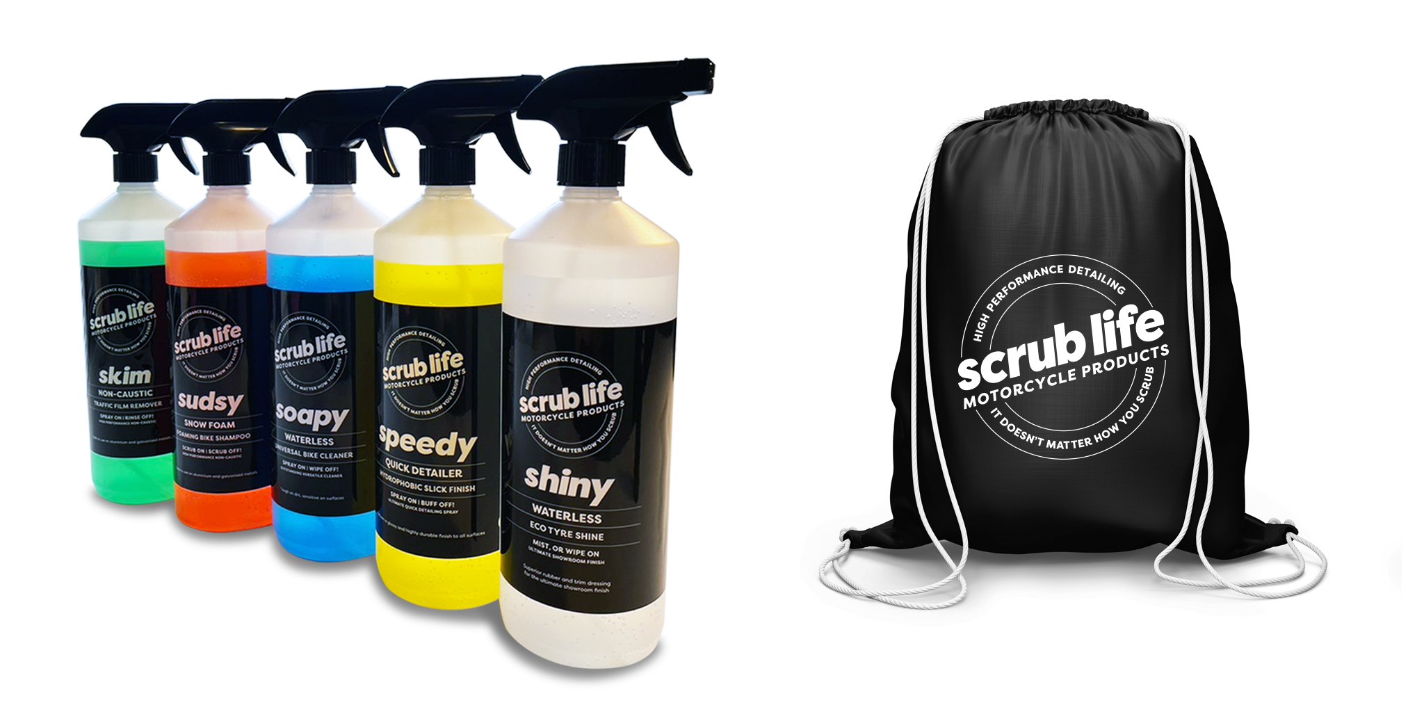
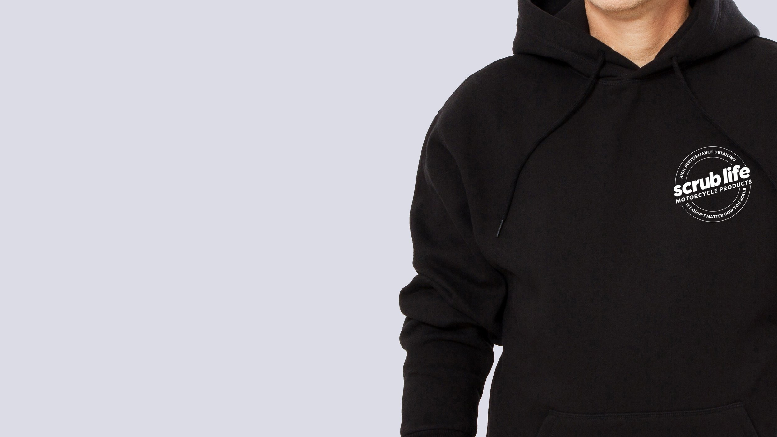
A logo that could easily be applied to labelling, merchandise, and later down the line, digital media. It should appeal to motocross fans and sit well with other motocross brands. Then, the design of labels for a small product range. And finally, branded merchandise, to be sold to enthusiasts of the sport.


The solution
To be very clear who scrub life is talking to, the angle of the scrub life name in the logo nods to the angle of a bike heading into a scrub, underlined by ‘motorcycle products’, within an elipse to echo a wheel. The strapline is incorporated into the logo itself, so that the primary logo is a single element.
Following a first presentation showing a range of concepts, the logo was further developed and tweaked to adapt to different use. To create a brand image that would contrast well with the predominantly brightly coloured cleaning fluids, the black and white branding was decided.
I created names for each product and designed a labelling system that would be consistent across different-sized bottles of 500ml, 1L, and 5L. The labels were set-up, printed and supplied so that Matthew could label the products himself using a labelling machine.
And, finally, t-shirts, hoodies, and bags were screen-printed with the new logo.