
It’s all black and white for BLOCK. Branding a new way of working.
I already had the pleasure of knowing the guys at BLOCK, as I’d previously worked with BLOCK’s founder, a successful South West entrepreneur, on numerous other brands of his making. So, when founder, Ben Cheriton, brought in sassy Head of Marketing, Lisa Brammer, to champion the BLOCK brand, I was chuffed to bits to be approached for the brand development of its offshoot, BLOCK WORKSPACE.
This was a slightly unusual project for me, as the BLOCK brand had been already created by another agency. So, the brief - to develop a brand that is clearly part of the same family, but stands up in its own right. Was a challenge I relished. I was happy to roll up my sleeves and get stuck in.


“I’ve worked with Claire on quite a few projects, the most significant being a total brand design and development campaign. Claire worked with our team from the very initial brief right through to launch to devise a brand concept and all initial marketing materials. Not only did Claire have incredible ideas and vision for our brand, she was a great person to work with. Patient, creative and super fun! Highly recommend! ”
The brief.
Housed in the spectacular Melviille Building and located in the prestigious Royal William Yard, Plymouth, BLOCK is a workspace quite unlike any other in the region. And the stall had been set out by its very distinctive black and white branding.
Owned by the same group, BLOCK WORKSPACE provides a very similar offering, that of affordable, benefit-laden workspace and co-working space, but in slightly less salubrious surroundings, as the Melville building that houses BLOCK really is very special indeed, even offering an on-site gym for its members.
BLOCK WORKSPACE was to be launched with new premises adjacent to the M5 at Taunton. A fabulous location in the gateway to the South West. So branding and collateral were needed for the launch and beyond.
It was super important to me to respect the creative that had already been realised for the BLOCK brand. But, also important to give the workspace brand its own little quirks.
Working with the BLOCK brand as a guide, there was no doubt in my mind that the workspace brand should be consistent to and in keeping with BLOCK. So keeping the same clean black and white theme, font and typographic style was a must.
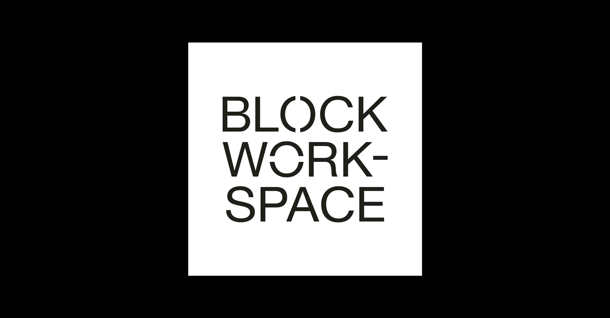
The resulting logo for WORKSPACE leaves no doubt that it is part of the BLOCK family.
Beyond that, there was much more work to do to roll out this new brand, which included every aspect of its digital footprint and beyond. So, this brand development project included conceptualisation of its front end web design, logo animation, social media creative, and much more…
Best of all, following the great example already set by the BLOCK brand, I had the pleasure of creating stunning printed materials for BLOCK WORKSPACE.